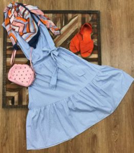
1. Play with proportions. When you start trying to pair prints, sometimes it might seem that your attempted ensemble is yelling at you! That may be because you’re pairing two prints that are too similar, instead of playing with proportions. You don’t have to shy away from blending prints in the same family, simply pair a small version with a bigger one. You can also look at the boldness of the pattern, a small subtle plaid can pair nicely with a bolder buffalo check pattern. We were wowed when Stacee pulled together this effortless spring ensemble by matching this colorful striped scarf with the tiny blue stripes on this gorgeous midi dress. It’s a great example of how big and small versions of the same print can complement one another! Then, she highlighted the other beautiful bright shades of the scarf by adding lively orange shoes and a pink crossbody bag to pull the entire look together!
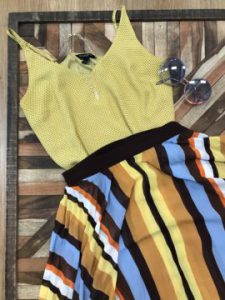
2. Build around a base color. While making entirely different prints “match” may sound impossible – you can match colors and tones to make separates seem more meant-to-be! Achieving the visual balance you want from print-mixing relies on finding a complementary color palette. Inverted color schemes work great – where the base color of each print is secondary in the other piece. We love this look Stacee created using a small dainty print on top to match the bold mustard yellow in this patterned skirt. The proportions are on point, and the colors in each print complement the other. The band on the skirt also helps to create some separation between the two prints. This look gave us mod-meets-hippie vibes, so Stacee paired it with a chunky white sandal and some cool transparent circle sunglasses for an easy look that still makes a statement.
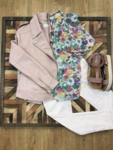
3. Break it up with a “third piece.” When you’re looking for patterns to use, florals and are easy go-to prints that offer a lot of variety! But, don’t sleep on stripes! A small stripe can easily act like a solid when paired alongside a floral or animal print! Stacee taught us that you can easily blend two prints by mixing in a “third piece” in a complementary solid color, especially one that crosses the body – a jacket, belt or cross-body purse for example! She showed us how to bring all these tips together in this final outfit. A big, feminine floral blouse is paired with a skinny stripe in a coordinating shade of pink. Then, a gorgeous faux-leather jacket ties it all together while giving a little visual reprieve from the two printed pieces. We love the mauve espadrilles Stacee pulled in to match – with a little stripe on the base, too! This entire outfit was less than $40 at a Goodwill location!
This article was adapted from the Goodwill Industries of the Southern Piedmont blog, and all the items shown here were purchased at the Goodwill of Southern Piedmont’s retail stores. Follow the Goodwill of Southern Piedmont on Instagram to stay up on the latest trends and tips, and to find out when Stacee’s pop-up is launching each month: @GoodwillSP.
About our guest blogger:
Stacee is a wardrobe stylist and fashion insider who has been featured on E New!, FOX, and BET, among others. You can find her around Charlotte and the nation styling famous athletes, celebrities and artists. Now she’s shopping for you — handpicking trendy items each month that will be available in a Styled by Stacee collection at Goodwill of Southern Piedmont’s fashion-focused GW boutiques. When you shop Styled by Stacee, you’re not only getting trendy items handpicked by a professional for a fraction of the price – you’re also helping to fund Goodwill’s mission of providing job training and employment services free of charge. Follow Stacee on Instagram at @itsstaceemichelle.